Case 01 / Mobile app
Building a Mobile-First AmMall Shopping App
Translating a desktop marketplace into a mobile-native app — with clearer navigation, faster search, and a streamlined checkout for the 63% of users already shopping from their phones.
01 — Context
A desktop product, used mostly on phones.
AmMall originally existed as a desktop website. Analytics told a different story: the majority of product traffic was already coming from mobile devices — but the mobile web experience was still a desktop-first layout, scaled down.
I explored two paths in parallel:
- A native mobile app so repeat users could easily complete key tasks — product discovery, evaluation, and checkout.
- A mobile web optimization to fix immediate usability issues.
This case focuses only on the mobile app experience.
02 — Problem
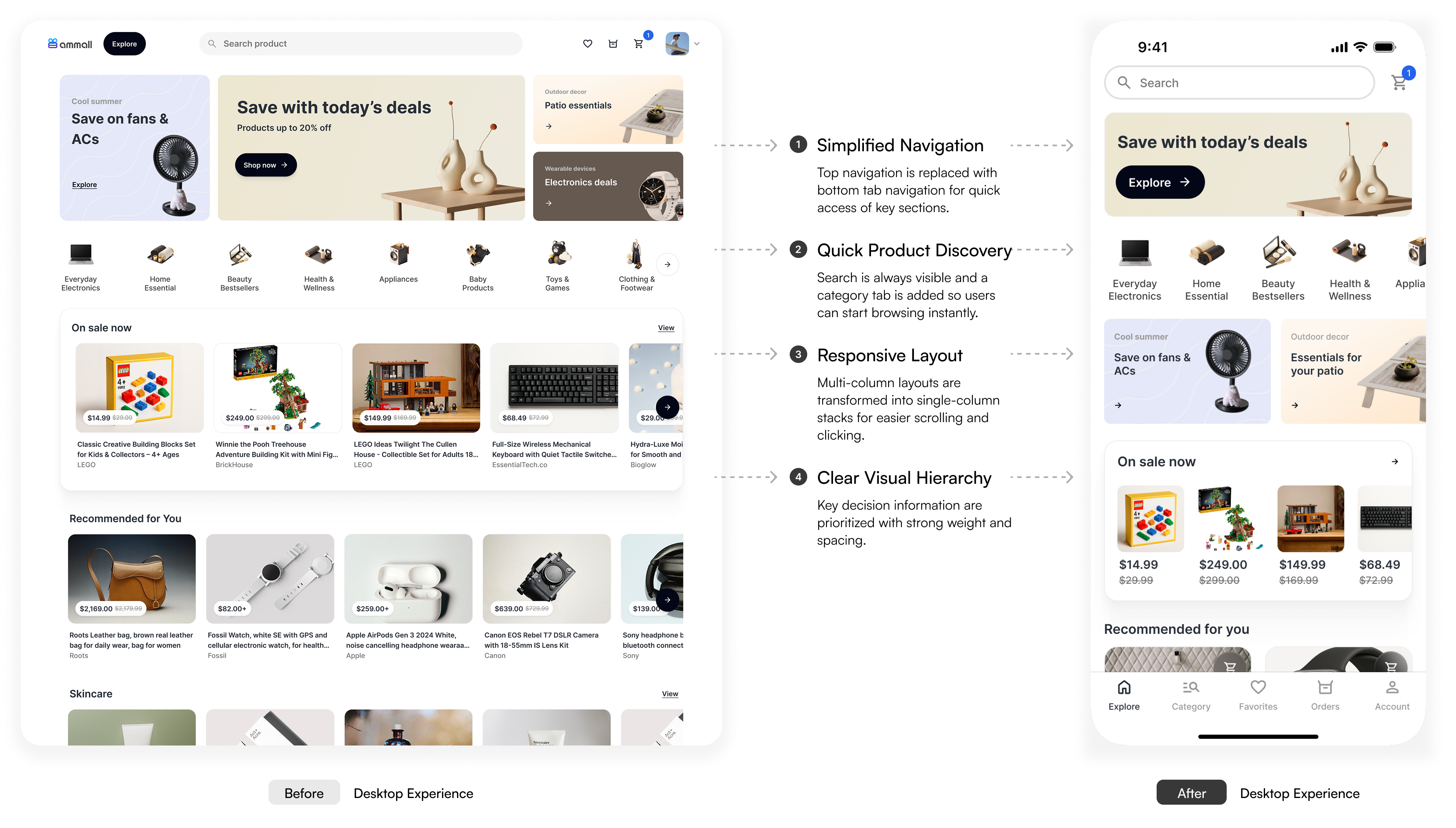
A desktop layout, squeezed onto a small screen.
The desktop experience relied on large pages and patterns like dropdown menus and drawers — none of which translate cleanly to mobile. Users needed to switch quickly between tasks and move through decision points, but dense layouts and unclear navigation increased effort and cognitive load.
Goal — Ensure users can easily complete key tasks, from discovery to checkout, on small screens.
03 — Research
Three insights about how people shop on phones.
Insight 01
Mobile shoppers make rapid, incremental decisions.
Rather than deeply evaluating every product, users quickly eliminate options and only investigate promising items further.
Implication — Surface the most decision-critical information early to reduce unnecessary taps and support faster comparisons.
Insight 02
Search is a primary navigation behavior.
Many users navigate online shopping through search before they ever touch a category.
Implication — Search must remain easily accessible throughout the app.
Insight 03
Users frequently switch between tasks.
Shoppers jump between reordering items, exploring new ones, and viewing their cart. They rely on familiar navigation patterns — tabs in particular — to move quickly between task flows.
Implication — Navigation should support quick context switching without losing progress.
04 — Needs
What success looks like for users, business, and project.
Quick, low-effort shopping
Search, compare by price and specs, and switch sections without losing context.
Mobile conversion & retention
Lift mobile conversion and repeat purchases from the 63% already on mobile.
Consistent patterns
Clearly defined patterns and flows that fit existing backend systems.
That's why I followed three principles throughout the design:
- Prioritize decision-making information — surface the actions (e.g. search) and information (price, image, brand) users need to complete tasks and make decisions.
- Reduce cognitive load — use navigation that aligns with users' familiar mental models, and break large chunks of information into sections or pages.
- Support task switching — let users move between sections without losing context, so a side trip never costs progress.
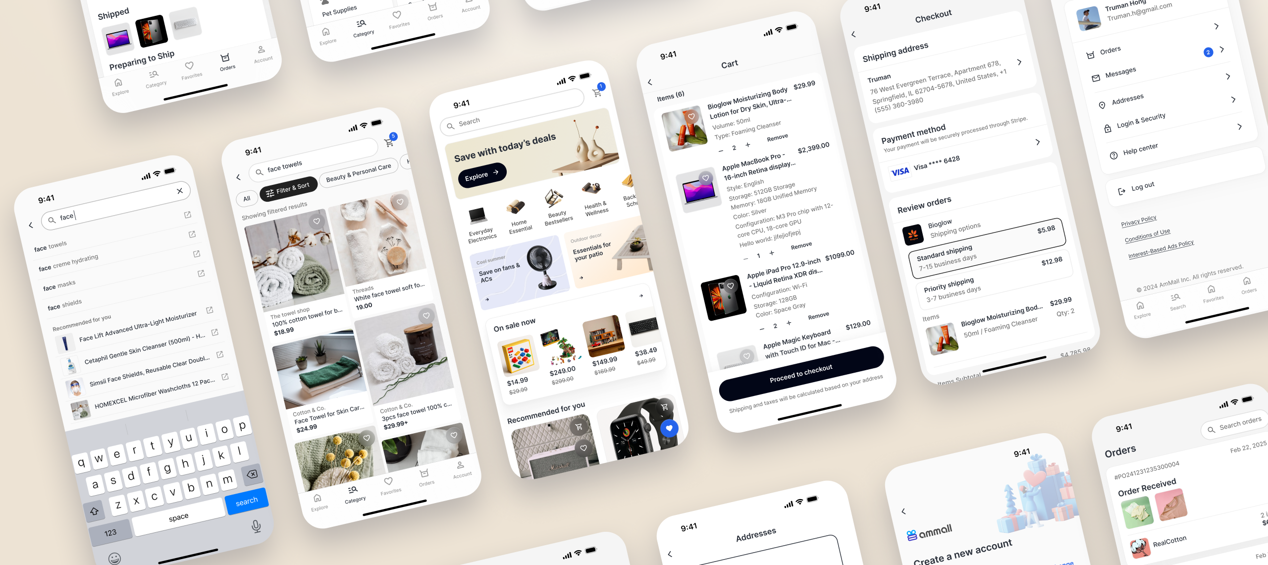
05 — Solution
Five design decisions.
Decision 01
Enable faster product discovery.
- Insight
- Users rely heavily on search when looking for products.
- Design
- Added a dedicated Search & Category tab so users can start searching at any moment. The search button stays visible at the top of every browsing screen.
- Outcome
- Users reach product discovery immediately, without navigating through multiple screens.
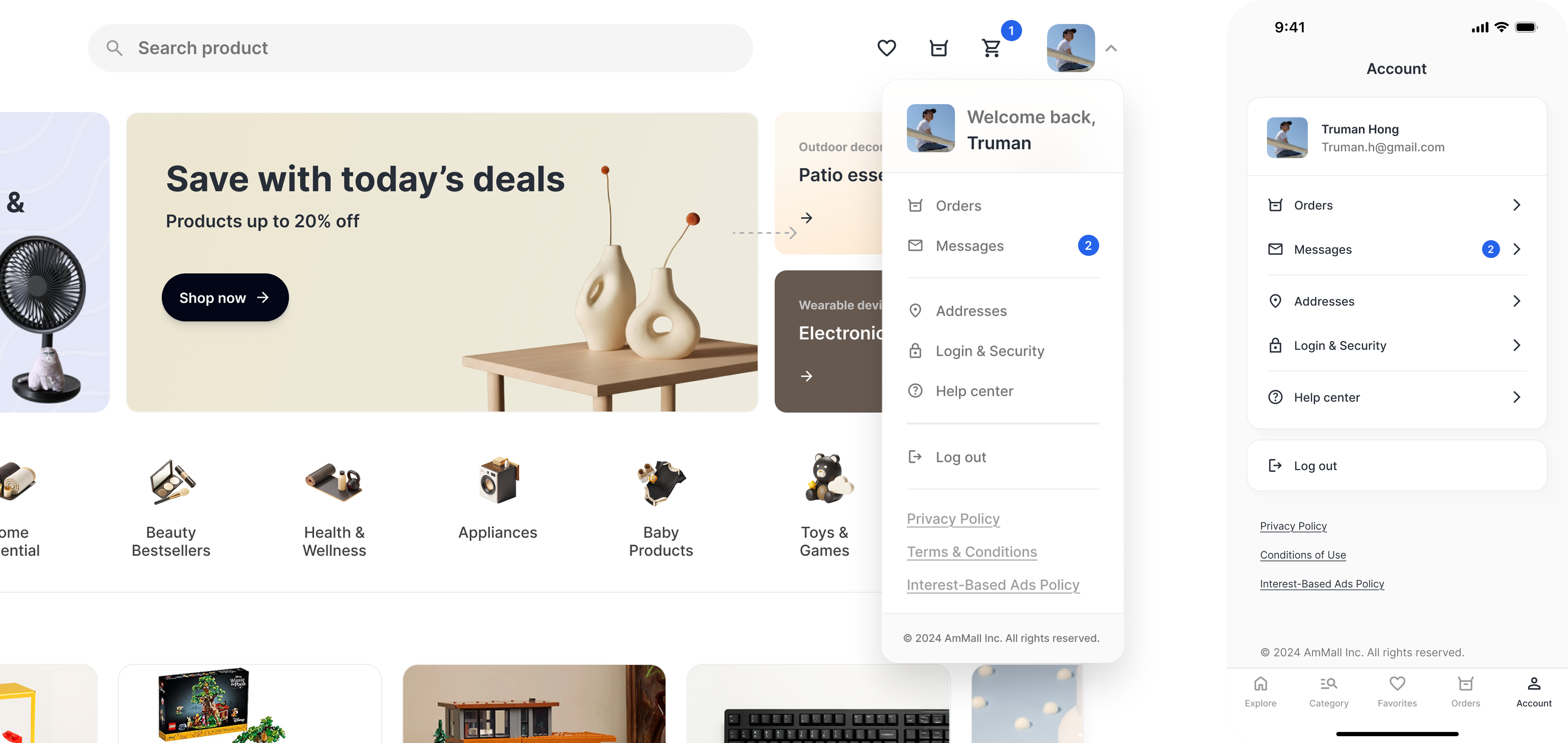
Decision 02
Align navigation with familiar app patterns.
- Insight
- Users rely on familiar navigation patterns when switching between tasks.
- Design
- Created a dedicated Account tab — moving account settings, help center, and policies from the desktop dropdown into a structured mobile hub.
- Outcome
- Users access account-related tasks using patterns common in mobile e-commerce apps.
Decision 03
Reduce cognitive load in checkout.
- Insight
- Mobile users complete tasks in short sessions and benefit from simplified screens.
- Design
- Redesigned checkout into layered screens — Checkout overview · Address management · Address input form.
- Outcome
- Breaking the flow into steps reduces visual density and makes checkout easier to scan.
Decision 04
Improve visual hierarchy for small screens.
- Insight
- Users mainly focus on key decision information — price, specs, reviews.
- Design
- Adjusted typography, spacing, buttons, and padding to create stronger hierarchy and breathing space. Created a mobile component library (header, product card, etc.).
- Outcome
- Important information stands out more clearly, making product evaluation easier on small screens.
Decision 05
Keep the next step always visible.
- Insight
- Mobile users prefer quick progress through focused tasks.
- Design
- Introduced a floating next-step button that adapts to the current stage — Product page → Add to Cart · Cart → Proceed to Checkout · Checkout → Submit Order.
- Outcome
- Users can always take the next action without scrolling or searching for buttons.
06 — Impact
What the app now does for shoppers.
- Successfully translated the desktop shopping experience into a mobile-first app — making discovery, evaluation, and checkout easier on small screens.
- Reduced friction at key decision points by simplifying navigation and keeping primary actions visible throughout the shopping flow.
- Introduced a dedicated mobile channel for shopping — a more convenient experience for returning users, and a foundation for repeat purchases.
Mobile-first isn't a smaller layout. It's a different rhythm — short sessions, quick decisions, and a thumb that always knows where the next step lives.